Illustrating inspirational people-Malala Yousafzai |My Sketchbook
- Gina Shord

- Jun 28, 2022
- 3 min read
Updated: Oct 18, 2022
My mission at the moment is to improve my portfolio & attract the clients/ commissions I dream of.
Looking through my folio I noticed I don't have many illustrations of people who have changed history or influential people. So I chose to illustrate Malala Yousafzai- the woman who fought for female education, was the youngest person to win the Nobel peace prize and was shot by the Taliban & survived.


I started researching Malala and collecting imagery to do with her, I collected quotes which I could include in some way:
“If one man can destroy everything, why can't one girl change it?”
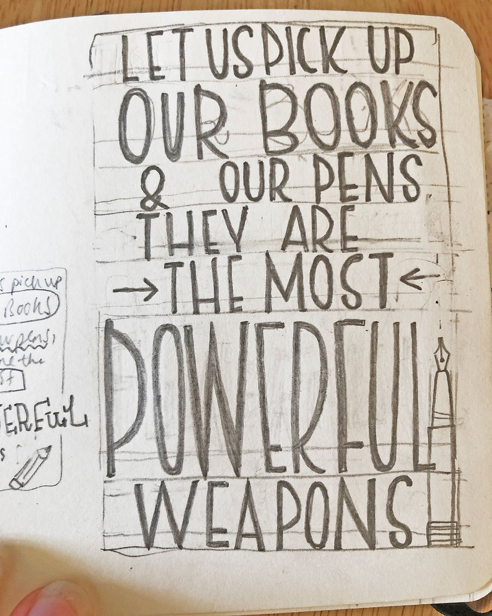
“Let us pick up our books and our pens, they are the most powerful weapons.”
“Life isn't just about taking in oxygen and giving out carbon dioxide.”
“We liked to be known as the clever girls. When we decorated our hands with henna for holidays and weddings, we drew calculus and chemical formulae instead of flowers and butterflies.”
The quotes highlighted are the ones that I found most inspiring.
I then started researching on pinterest for visual inspiration, things to influence the colour pallet, lettering, pattern etc. The lettering and colour pallet I took lots of inspiration from Indian art and patterned Indian trucks.

I always pin imagery so I can look back and refer to this later on. If you haven't got Pinterest I would recommend you get it for your projects.
I then start roughly planning layouts & combining imagery from my research. I like to draw without the research in front of me so my style also comes into it and I don't get tempted to refer to the image too much.
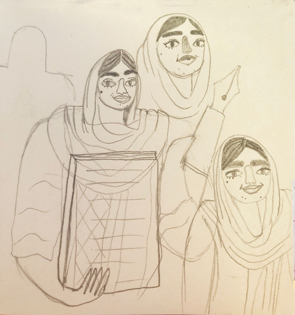
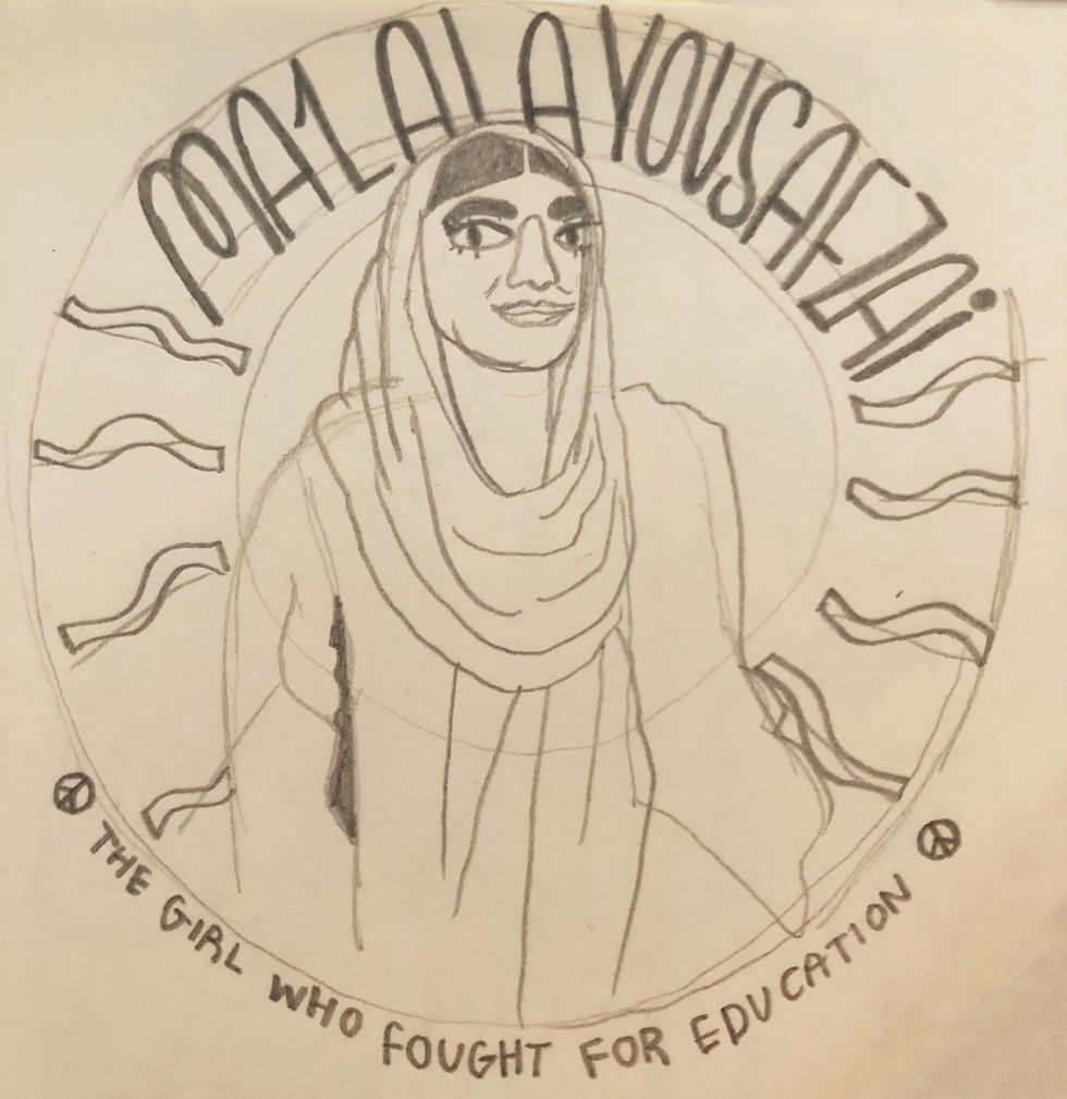
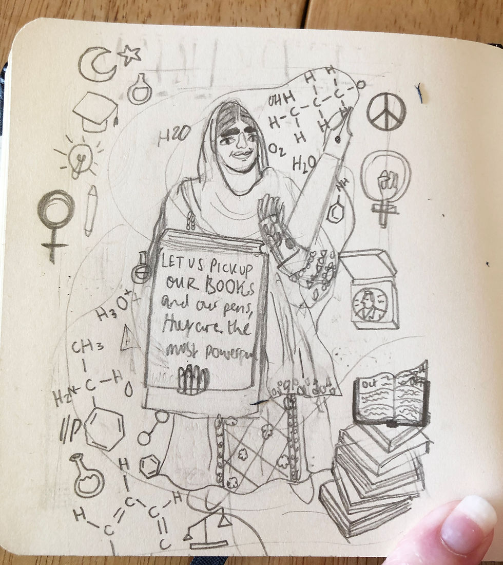
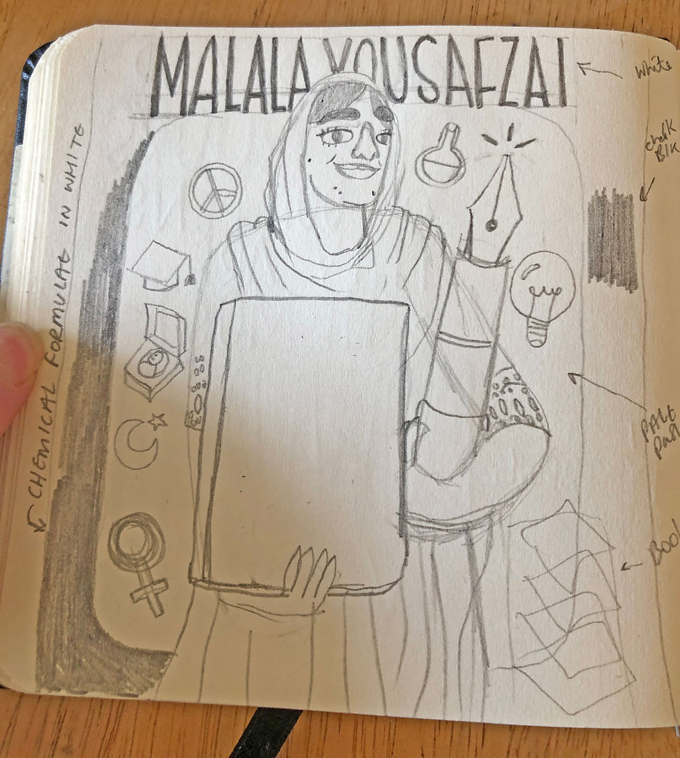
when I like an idea I then redraw it combining the elements which work and leave out the bits that didn't.
For elements which are more detailed I like them draw them separately and combine them in photoshop or Procreate as this gives me more freedom to edit.



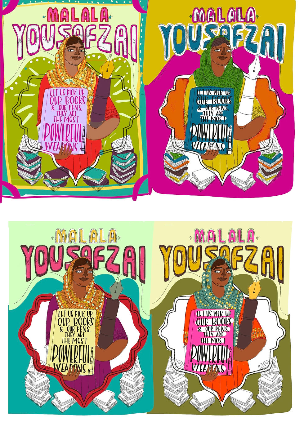
I forgot to scene shot at this stage but drew the more finalised rough in Procreate. Once I was happy with the design tested 4 different colour combinations, when a colour wasn't working I tweaked the hue till I liked the colours. As I'm working in Procreate layers become blurry if you move them too much so I always get my design just how I want it & plan the colours so when I do the final the layers are not blurry.
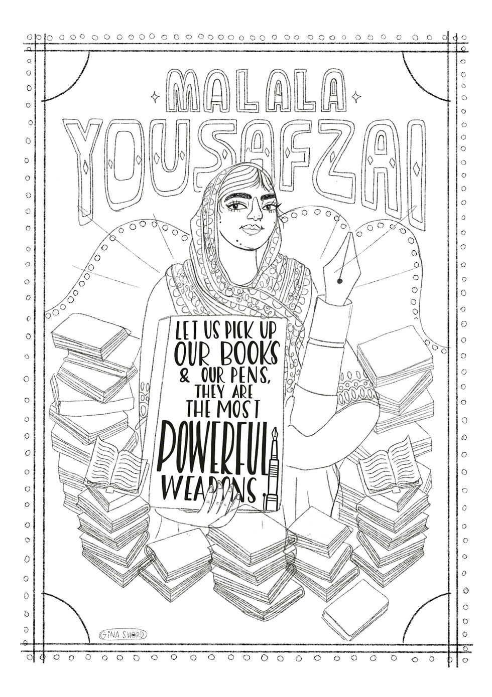
After choosing my colours looking at the finalised sketch I wanted to make adjustments it more I felt the shaped frame wasn't needed and wanted to add a frame and more books. I also moved her over to the left because she was looking very static in the middle. (rule of thirds).
I added the chemical formulas to the background because of the quote “We liked to be known as the clever girls. When we decorated our hands with henna for holidays and weddings, we drew calculus and chemical formulae instead of flowers and butterflies.”

Overall I was pleased with how this piece turned out, I feel it could be used for editorial or a book cover. I also usually do a different style nose but I feel my style is leading away from that.
I also find it super helpful to illustrate someone you find inspiring as it brings the piece to life.
Thank you for taking the time to read this, I hope it has been helpful to you in some way and if you know someone who might enjoy it too: please share it forward. ✌️
If you would like to visit my illustrated shop:
If you want to commission my work contact my agent Spinning Yarn Reps:
Got socials...? Let's be friends!
🌈 Instagram:
🌈 Facebook:
🌈Tiktok:
🌈Pinterest:
✏️✏️✏️✏️✏️✏️
If you have found the information on my blog helpful, you can support me by making a small donation through ko-fi here pay via Paypal or Stripe. ✨


Comments